SLICE
Slice wants to bethe bank for Gen Z.
But right now, it feels like a fintech app that forgot who it was building for.
Banking
Secondary Research
UX Researcher

What Slice is.What Slice wantsto be.The gap.
Slice is an Indian fintech app built around UPI payments, savings, and credit. Its bet is specific - not to out-feature GPay or PhonePe, but to be a bank built for Gen Z.
The ambition is real. The experience hasn't caught up.
Between what Slice says it is and what users feel when they open the app, there's friction - broken flows, silent failures, and a home screen that shows data but never tells you what to do with it.
Positioning vs Reality
Bank for Gen Z
- Fast, intuitive payments
- Transparent savings growth
- Responsive support
- Feels alive, not static
Generic Fintech App
- Scan that doesn't scan
- KYC loop with no feedback
- Support buried 3 taps deep
- Home screen feels like a ledger
"The vision is clear. The experience hasn't caught up."
Not only as a researcher.A daily userwho started asking why.
"This isn't a theoretical audit. It's what happens when the person doing the audit is also the user."
Play Store - Users confirming the same frustrations
"Why does scan to pay not actually scan? Have to go looking for the camera every time."
Play Store - UPI Issue"Raised a support ticket 3 days ago. Just disappeared. No response, no email, nothing."
Play Store - Support Issue"KYC scheduling is broken. Couldn't tell if it saved after selecting a slot twice."
Play Store - KYC IssueDesignPrinciples &Ideation
Establishing a foundational rule-set to ensure the high-energy, modern fintech aesthetic balances technical precision with a bold, consumer-friendly personality.
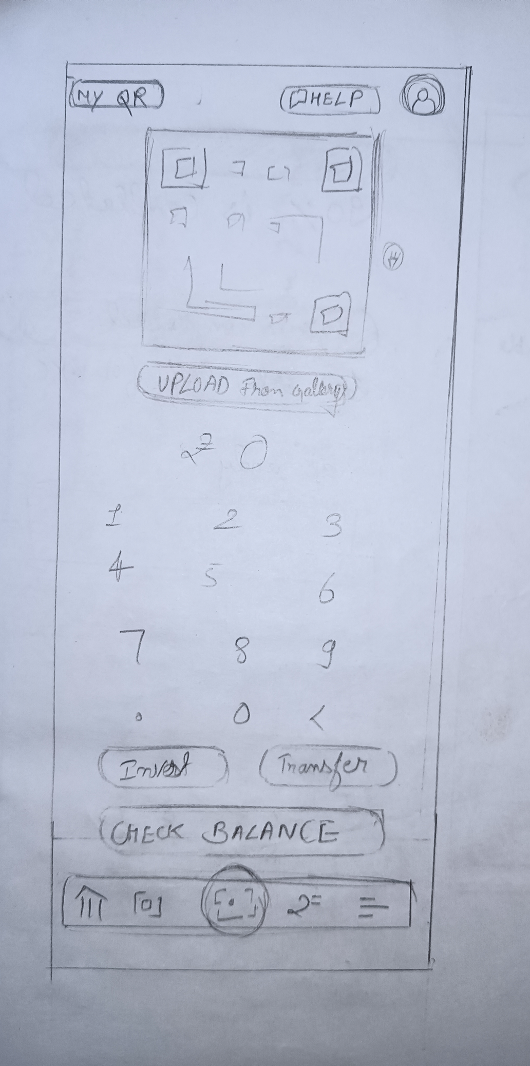
Design forMuscle Memory
This principle directly inspired a design first - a unified Scan to Pay screen that runs a live viewfinder and amount entry simultaneously. The first of its kind in Indian UPI apps. Faster than any tap-to-scan then amount flow currently in the market.
Transparentby Default
System states, financial data, and processing steps are exposed clearly. No hidden fees, no opaque loading states.
EmpatheticEscalation
Design manages errors and friction gracefully. Interventions escalate from subtle inline guidance to full-screen interruption only when necessary.
Actionableover Static
Prioritizes active engagement. Data is not just presented; it is contextualized with immediate next steps.
Speed isthe Feature
Applied across all flows. Transitions are instant, loaders are minimal, and unnecessary taps are ruthlessly eliminated.
The Audit & Fixes -Final Design
A deep dive into the friction points of the Slice app and our proposed architectural solutions.
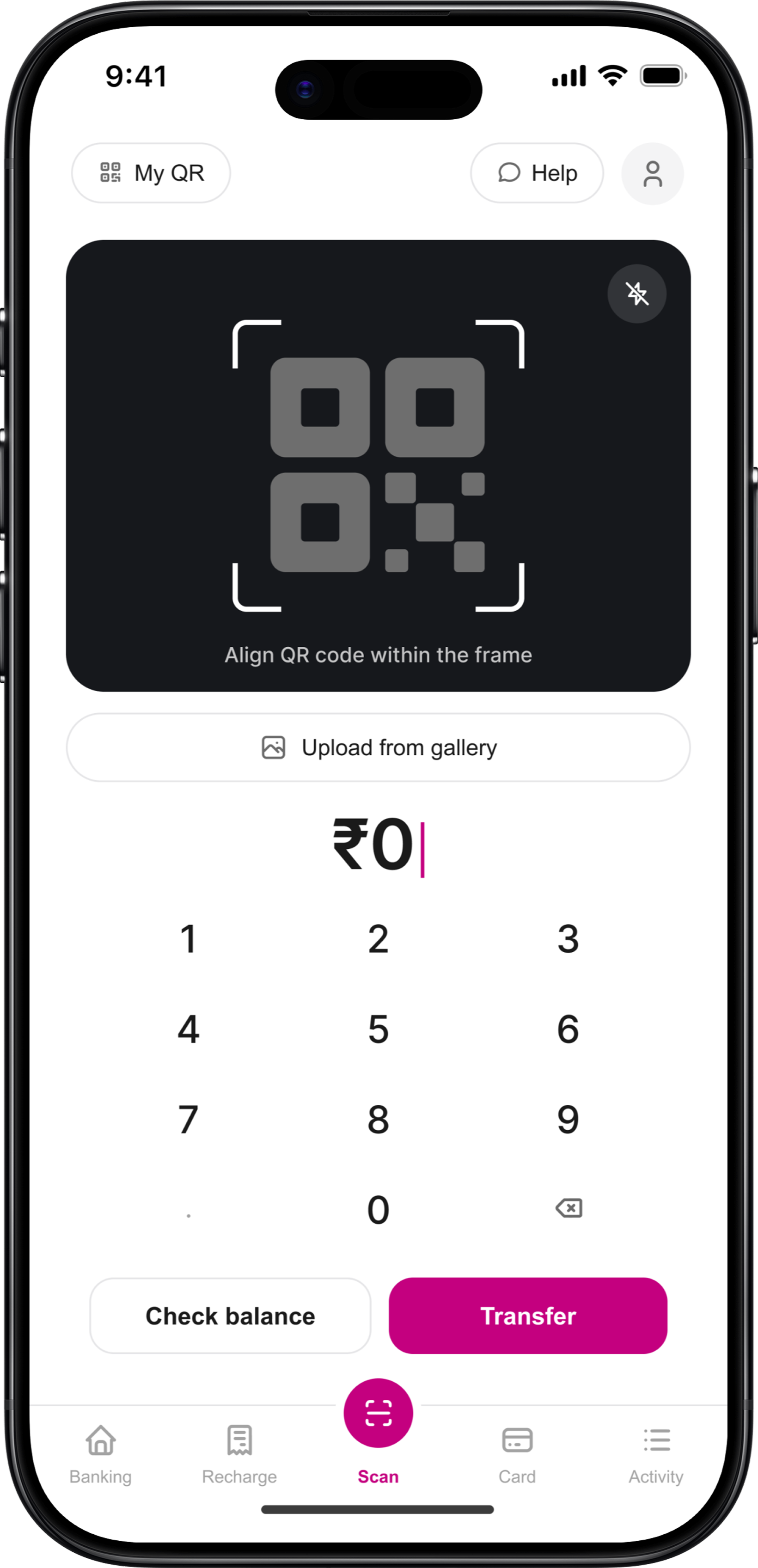
Scan to Pay
Tapping Scan doesn't open a camera. It opens an amount entry screen. No viewfinder. No instruction. A broken mental model for every Indian UPI user.
"Why does scan to pay not actually scan? Have to go looking for the camera every time."
Play Store · UPI Issue
The first UPI payment screen that combines a live viewfinder and amount entry in one unified view - eliminating the tap between scanning and paying that every other app still requires.
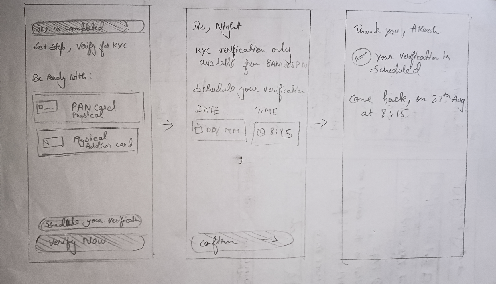
KYC
Onboarding
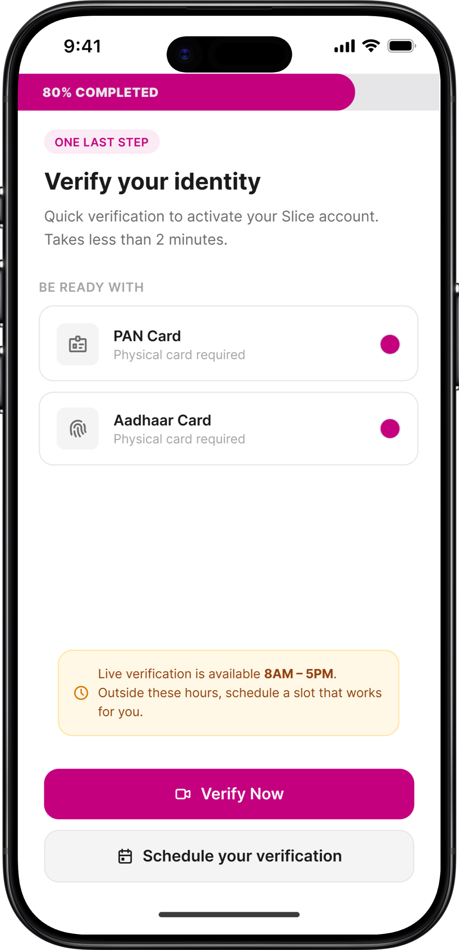
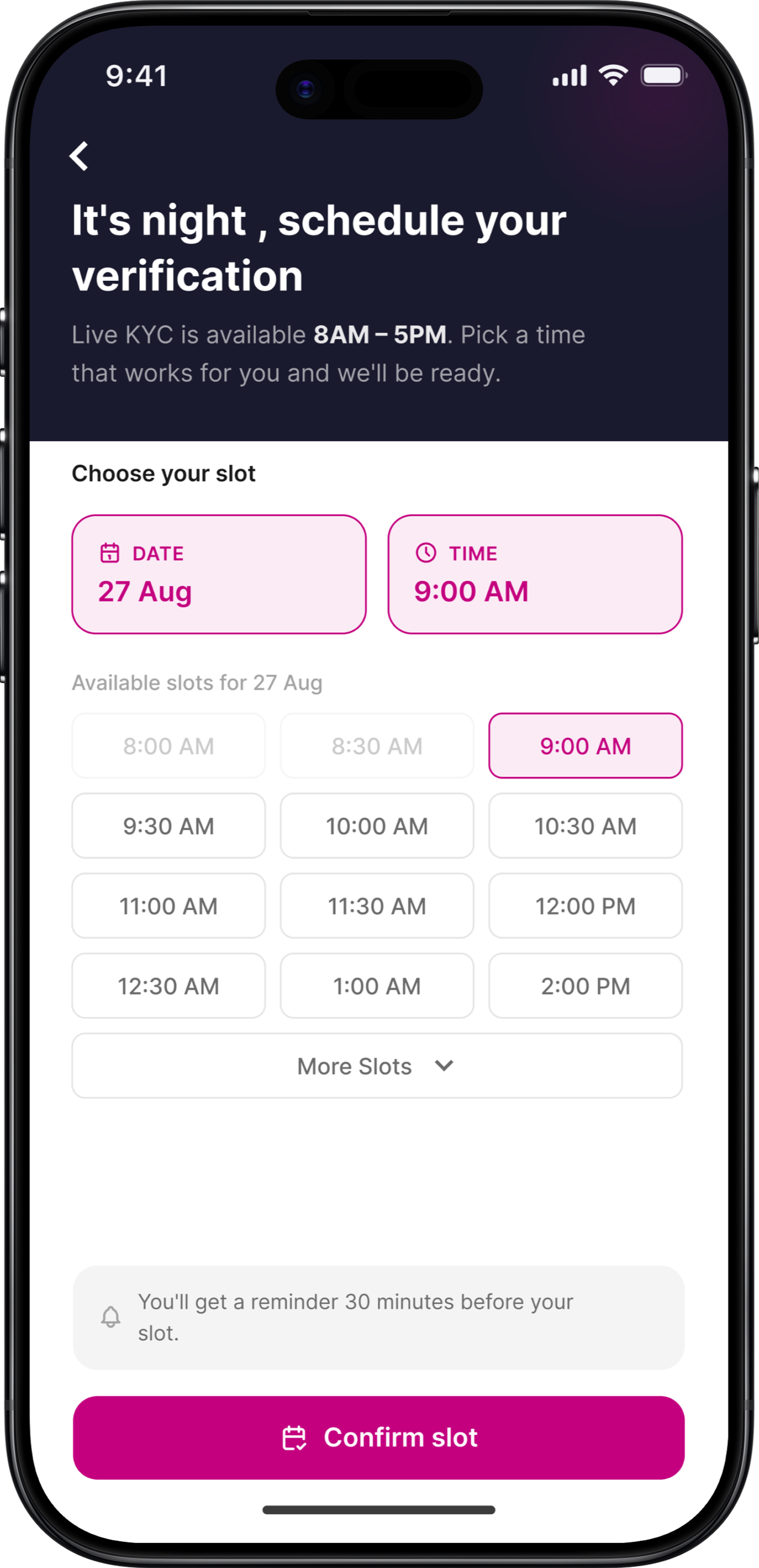
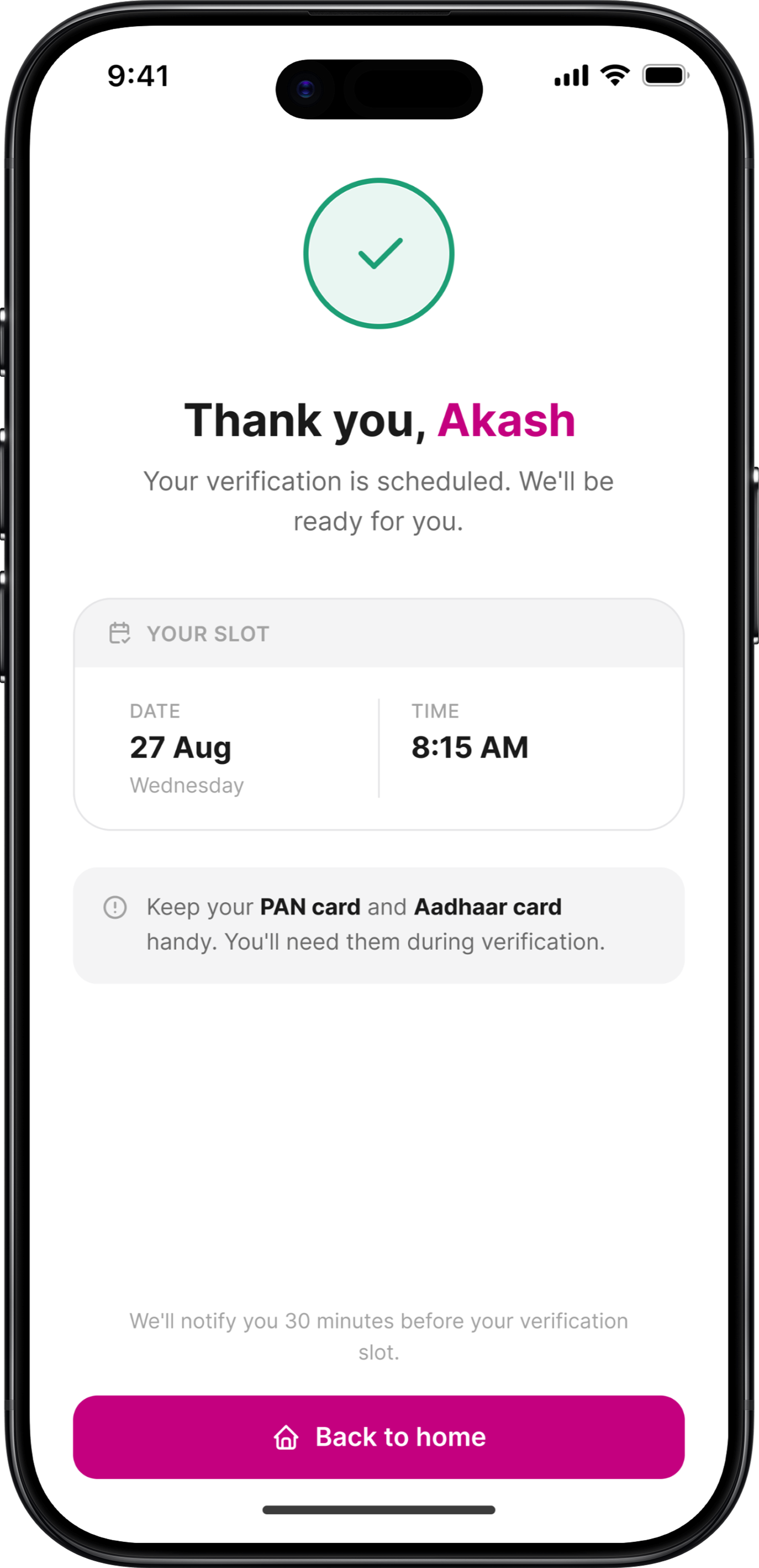
Night-time verification sends users into a scheduling loop. Date selected. Time selected. Confirm tapped. Back to the same screen. No confirmation
"KYC scheduling is broken. Couldn't tell if it saved after selecting a slot twice."
Play Store · KYC Issue
Every action now has a response
no loops, no silence, no doubt.
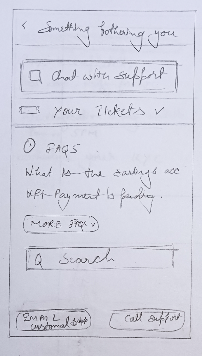
Customer Support
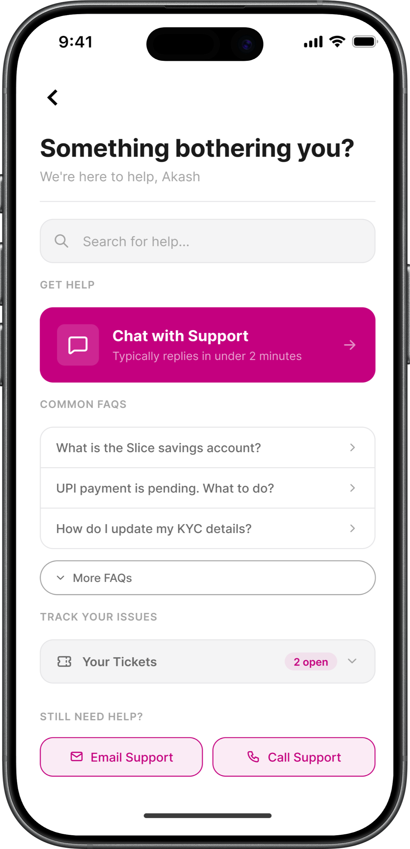
Finding support means navigating to your profile, locating a chat option, and hoping someone responds. Tickets get auto-closed with no resolution. The issue just disappears.
"Raised a support ticket 3 days ago. Just disappeared. No response, no email, nothing."
Play Store · Support Issue
Support surfaces where users need it, in the order they need it.
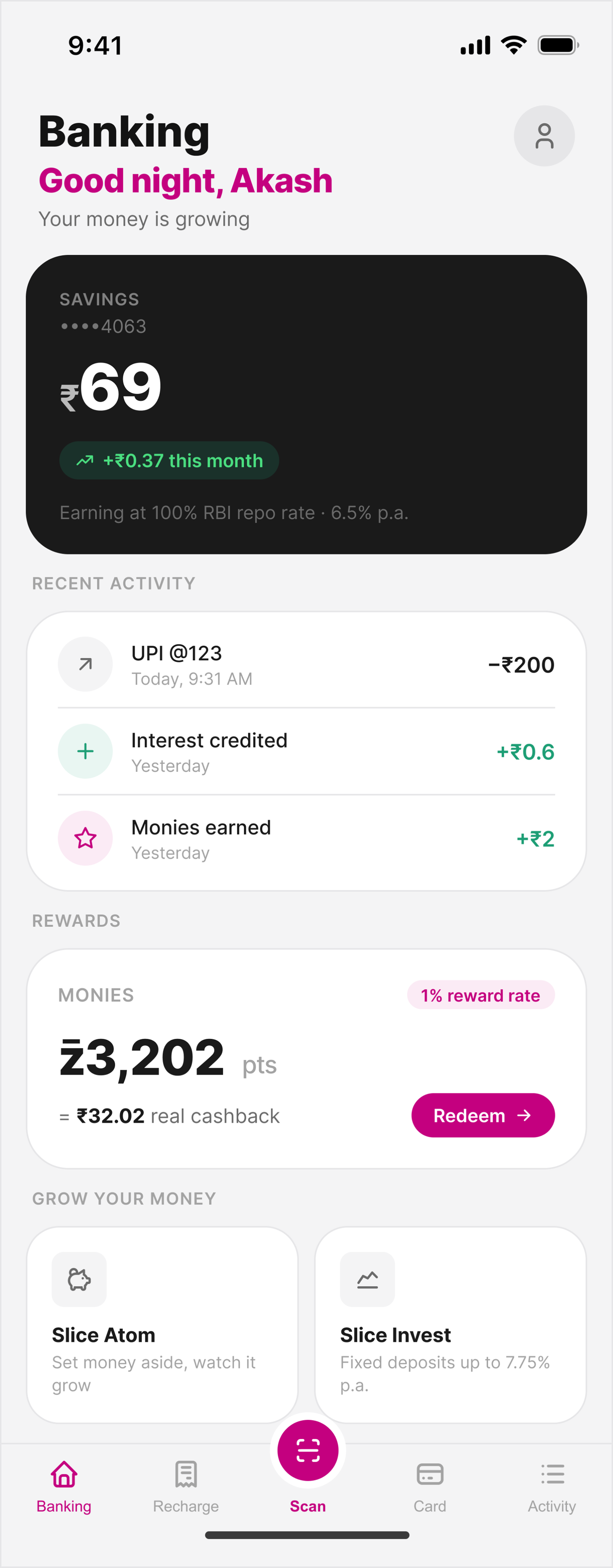
A banking screen that finally feels like the Gen Z bank Slice is trying to be.
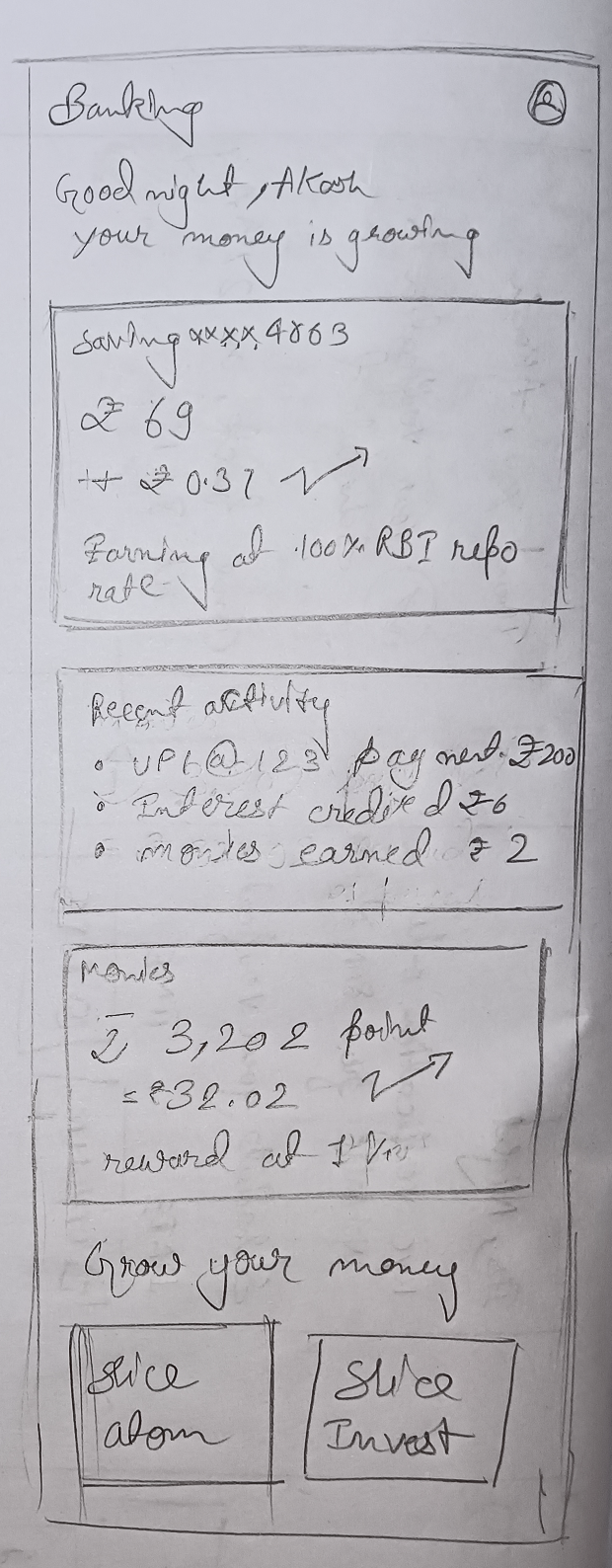
Banking Home Screen
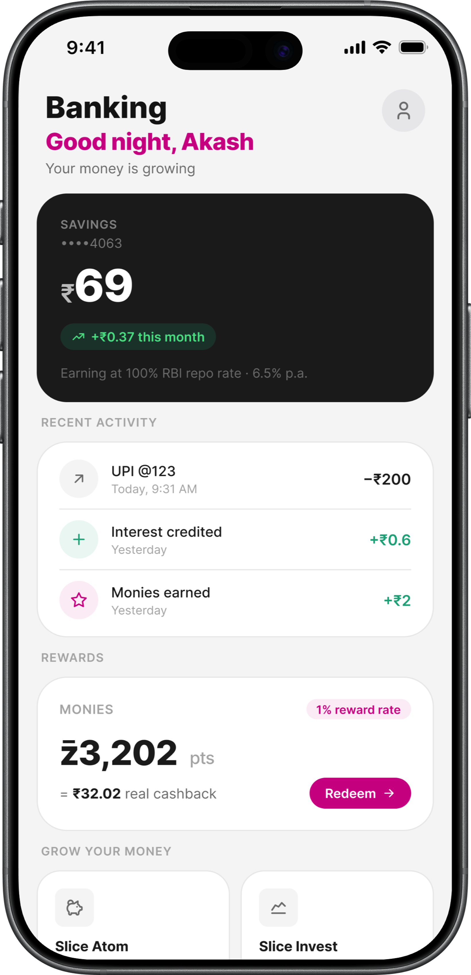
A static catalogue of cards - savings balance, fixed deposits, rewards - stacked with no hierarchy, no motivation. A Gen Z bank should feel alive. This feels like ledger
"The home screen shows everything but tells you nothing. I open GPay instead."
Play Store · UX Feedback
Static numbers become live signals
- your money, visibly working.
Four fixes.One positioning shift.
Gen Z doesn't switch banks. They switch apps-quietly, without complaint, the moment something feels off.
Product perception shift
"Fixed together, they don't just improve UX. They make the Gen Z bank positioning believable."
Each fix is a trust deposit
Camera opens instantly with fewer steps
Users stay in Slice instead of switching to GPay
KYC confirms clearly, user gets relief
Users trust the product before they've fully activated
Support is findable, stress comes down
Anxious users feel heard instead of abandoned
Home screen feels alive - more engaging to user
Savings and rewards motivate rather than sit idle
4 → 1
From Profile → Settings → Help → Chat to a single dedicated screen
0 loops
Every action now has a visible response and a clear next step
1 tap
Down from navigating a confusing amount-first screen
Slice has the right ambition.These changes give it the right foundation.
A bank for Gen Z isn't built in one feature. It's built in every small moment the app gets right.
Honest aboutwhat's still open.
What I'd
validate
The unified scan and amount screen works for me as a daily user. Before shipping, I'd want to test it with first-time users who don't have existing UPI habits.
- Live camera + amount on one screen - helpful or overwhelming for new users?
- KYC scheduling flow - does the slot picker reduce anxiety or add friction?
- Banking home - does recent activity on home motivate or clutter?
What's still
broken
Auto-closed tickets and silent reward removal aren't design problems - they're operational ones. The redesign surfaces them clearly. But fixing them requires decisions only Slice can make.
- Auto-closed support tickets - ops problem, not a design fix
- Rewards removed without notice - business decision needed
- No response time SLA - backend commitment required
What I
learned
Designing from inside the product - as an actual user - gave this audit something research sessions alone can't.
"The broken flows weren't hypothetical. The frustrations were real. That's what kept every decision grounded in evidence rather than assumption."
Slice has the right ambition. This case study is about closing the gap.
A bank for Gen Z isn't built in one feature. It's built in every small moment the app gets right.